Hello everyone, and Happy CLAMP Day! Mmmm…Spring is in the air and I really should be more produ
Eh…forget it…it’s raining…and the plague is still around. Let’s read manga instead!
For CLAMP Day this year, I decided to finally start reading Clover because I’ve never done so.

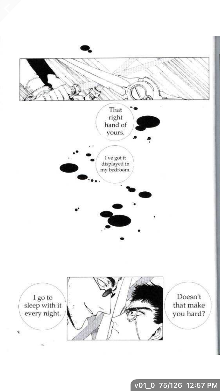
What struck me first and foremost about Clover was that there’s so much negative space in CLAMP’s artwork. In looking over some of my Tsubasa: RESERVoir CHRoNiCLE (everyone clap for me because I took the time to do the stupid capitalization) manga, it feels like the whole page gets taken up by backgrounds or action scenes. The panels can get very busy. Clover has a more ominous, mechanical, and lonely feel. Like the whole world is hard and devoid of natural elements like forests and lakes. A Brave New World meets Neuromancer type of deal.
That isn’t to say I don’t like the negative space. I think it really sells the isolation angle that it wants you to get from its lead characters, Sue and Kazuhiko.
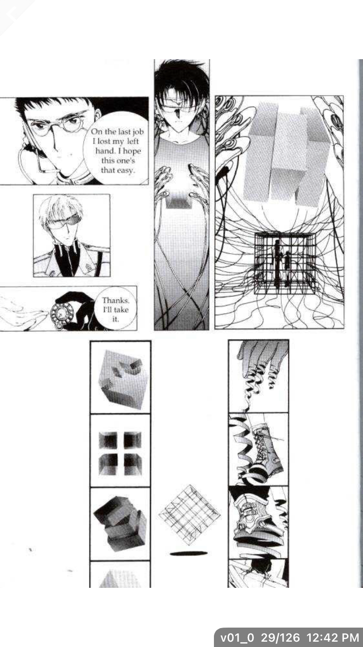
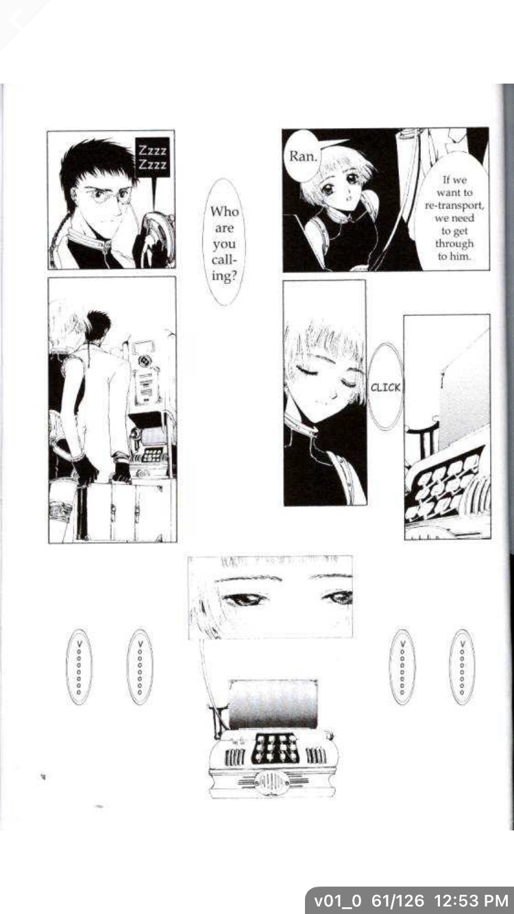
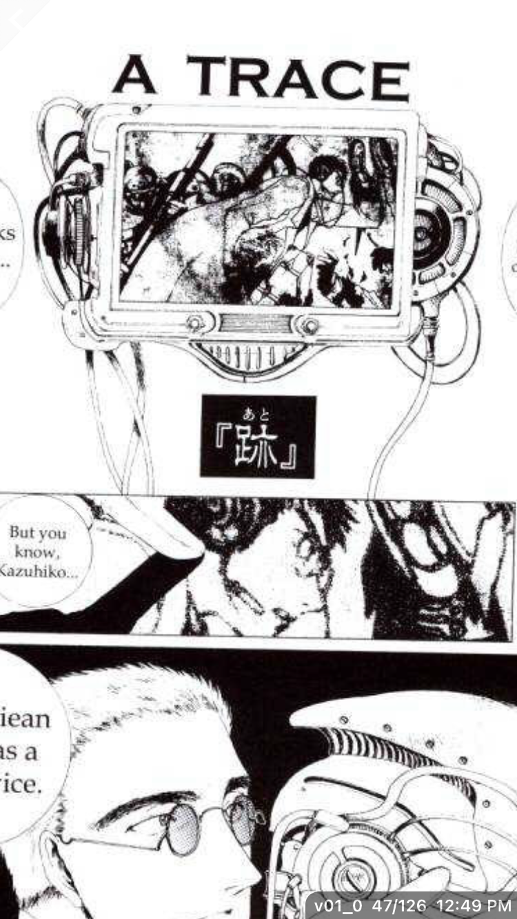
Another thing I really loved was how thoughtful CLAMP was with their designs. They have breakdown shots for things the the human body’s disintegration inside teleporter cube that Ran uses to send our heroes off to unknown danger, and Kazuhiko’s military grade weapon appearing.
Sue is obviously the best character ever. Is it because I’m biased, being that I am also a Su?! Yes, that is the first reason. The second reason is that
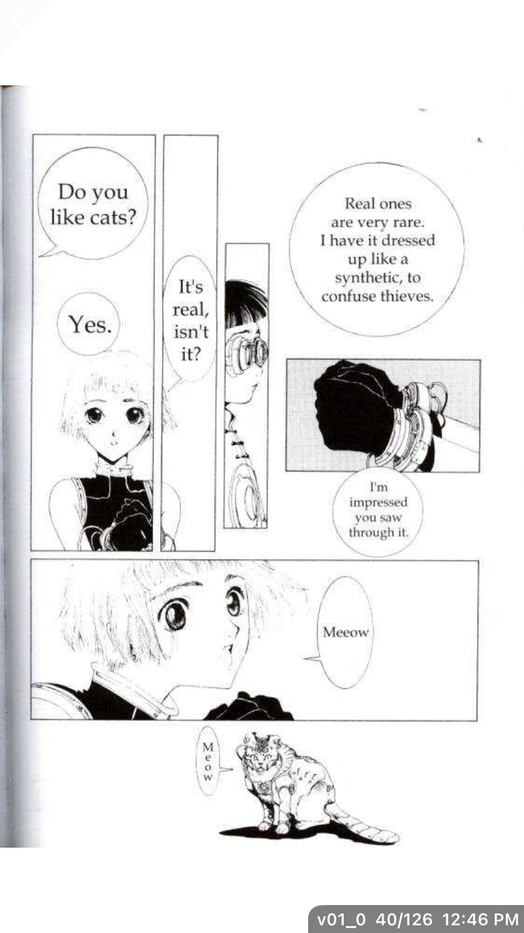
the girl can speak to cats, AND fax machines! Best girl, hands down.
I won’t comment much on the plot because I haven’t gotten far (only 126 pages in) but suffice to say I love that the story drops you right in and kick starts the adventure as soon as possible. I don’t know the two warring sides (I’m unclear if they even matter) but I feel a connection to Kazuhiko and Sue. The first 120 pages or so really sell their loneliness. The fact that they can rely on each other, even a little bit is this gentle, soft feeling in a world that’s so mechanized and robotic. A flower amongst a metal city.

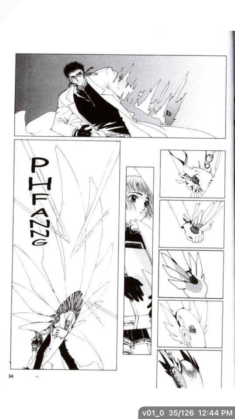
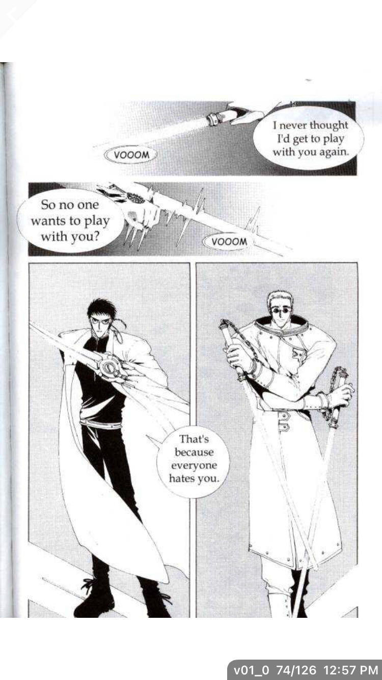
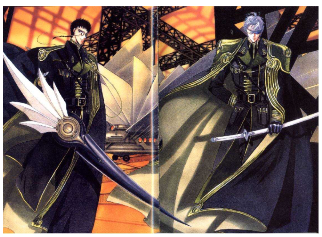
To end, I of course want to compliment CLAMP’s artwork. The sequence below is a great illustration of how great CLAMP is at color contrast and clear yet minimalist action scenes. I always feel like I understand the flow of action, without the panels needing to be cluttered or holding my hand. It’s a tribute to how great of a mangaka CLAMP is.
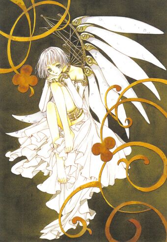
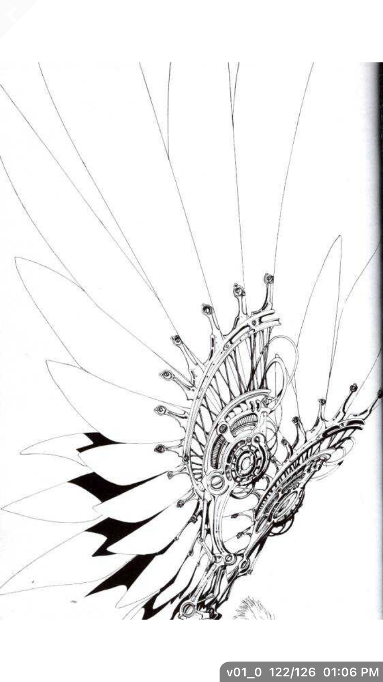
There’s also the matter of still shots of various objects. The video feed in the shot below could have been some throw-away design, but CLAMP chooses to give it this beautiful level of detail. That same beauty is in the iconic metal wings. At first glance you’d likely just fly by this shot, but seriously…take a look at the mechanical detail on these things. It’s incredible.
Well, that’s all for now. Are you a big Clover fan? Let me know in the comments! No spoilers please. I want to experience all that confusing CLAMP goodness for myself! As a final note, does anyone else miss the older CLAMP designs? The newer ones are beautiful but there’s something very…striking and bold about their older designs. Maybe I just like the way they use grainy coloring. The newer designs are very glossy and rounded. I like the organic, harsher tones they used here.
All images were captured from the Manga Bird app and all credit for the translation goes to Be With You Scans.

0 comments on “CLAMP Day 2021”